

Table of Contents
- Amber, opal or clear glass: which dropper bottle should you choose?
- Comparison table for amber, opal and clear glass dropper bottles
- Amber glass: a traditional light-filtering visual direction
- Opal white glass: an opaque premium presentation
- Clear glass: maximum product visibility and decoration flexibility
- Match glass color to formula exposure and packaging requirements
- Why color alone cannot establish shelf-life performance
- Compare decoration, collar finishes and brand positioning
- Check capacity, fill volume and user dispensing needs
- How to approve glass color and light-protection samples
- YBJ Packaging glass dropper bottle options to review
- Frequently asked questions
- Request amber, opal or clear glass dropper bottle samples
Amber, opal and clear glass each create a different balance of light management, product visibility and brand presentation. This B2B guide explains how to compare the three options, validate compatibility and request the right samples for a skincare serum or facial oil.
Amber, opal or clear glass: which dropper bottle should you choose?
Choose amber glass when reducing visible light exposure is an important packaging objective and a traditional brown appearance suits the brand. Choose opal white glass when the priority is a largely concealed formula, a white premium look and a clean visual system. Choose clear glass when product visibility, formula-color communication and decoration flexibility matter more than built-in light attenuation.
That is the practical starting point for comparing amber vs opal vs clear glass dropper bottles. It is not a substitute for formula stability or package compatibility work. Glass color is one part of the primary package; the bottle wall, glass composition, fill level, label or coating, dropper assembly, closure, shipping environment and secondary packaging can all change the final result.
A glass dropper bottle is a rigid glass container fitted with a closure that includes a pipette and a squeezable bulb. The bulb draws liquid into the pipette and releases it when the user squeezes again. In skincare, this format is often considered for serums, facial oils and other products where the brand wants a controlled hand-dispensing experience. The actual delivered amount depends on the formula and component design, so a drop should not be treated as a universal measurement.
For international buyers evaluating light protection cosmetic packaging, begin with the formula rather than the color name. Ask the formulator or quality team whether the product is sensitive to ultraviolet, visible or general light, how the filled pack will be stored and displayed, and what evidence is required before launch. Then compare physical samples rather than choosing from a screen image alone.
In simple terms:
- Amber: a brown-tinted glass direction that usually provides less visible product exposure than clear glass, but the degree of light attenuation must be confirmed for the selected bottle.
- Opal: a white or highly diffusing glass direction that minimizes visual transparency and supports a soft, premium presentation. Its actual light transmission still requires project-specific confirmation.
- Clear: transparent glass that lets buyers and users inspect product color and remaining fill. It generally provides the least inherent visual shielding unless labels, coatings, cartons or another package feature cover the product.
YBJ Packaging can be approached for custom glass dropper bottles and one-stop development support. Availability, bottle dimensions, neck finish, component materials, decoration, minimum order quantity, tooling, pricing, production timing and shipping depend on the project and must be confirmed against an approved sample.
The best choice is therefore the color that satisfies three requirements at the same time: the formula’s exposure and compatibility needs, the user’s dispensing expectations and the brand’s visual positioning. If those requirements conflict, a technical comparison of filled samples should decide the direction.
Comparison table for amber, opal and clear glass dropper bottles
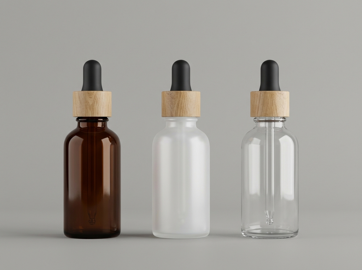
The table below is a directional sourcing comparison. It describes common design and purchasing considerations, not a guaranteed transmission rating, shelf-life result or regulatory conclusion. The selected bottle should be evaluated with the intended formula and dropper closure.
| Criteria | Amber glass | Opal white glass | Clear glass |
|---|---|---|---|
| Light exposure direction | Usually reduces visible product exposure compared with clear glass. The level of attenuation depends on the glass and bottle design. | Often appears opaque or highly diffusing and can conceal the formula. Actual transmission varies by construction and should be verified. | Provides high visibility and generally the least inherent light shielding. Labels, coatings or cartons may change the exposure profile. |
| Formula visibility | Limited. The fill line may be visible, but liquid color, sediment or phase changes can be harder to inspect. | Low. The white body creates a consistent exterior appearance but can make fill and formula changes difficult to see. | High. Users can see the product color, approximate fill level and visible changes more easily. |
| Brand direction | Traditional, apothecary, botanical, clinical or ingredient-led visual language. | Minimal, clean, soft, premium or modern visual language. | Transparent, laboratory-inspired, fresh, colorful or ingredient-display visual language. |
| Decoration considerations | Light or metallic decoration can create contrast, but ink, label adhesion and color accuracy need sample review. | Provides a white visual base and can pair with dark or metallic closures. Confirm color consistency and finish durability. | Supports direct viewing and many label or print concepts. Product color, adhesive, ink and coating interactions remain project dependent. |
| Main purchasing advantage | Balances a familiar skincare appearance with a degree of light-management potential. | Creates strong concealment and a distinctive exterior without relying on the formula color. | Supports visual inspection and makes the product itself part of the merchandising presentation. |
| Main limitation | Color should not be treated as a measured UV or photostability guarantee, and product visibility is reduced. | It may hide the fill and does not automatically provide the same transmission profile as every other opal bottle. | Light-sensitive formulas may require additional package controls and a documented exposure assessment. |
| Questions to confirm | Glass type, wall thickness, color consistency, light-transmission information if available and decoration tolerance. | Whether the body is true opal glass or another finish, opacity target, color tolerance and component contrast. | Glass clarity, surface quality, decoration coverage, secondary pack requirements and formula exposure limits. |
This comparison also shows why glass color packaging selection should not be separated from the closure. A transparent bottle with an opaque label may have a different exposure pattern from a fully visible bottle. An amber bottle with a light-colored bulb and collar may create a different shelf impression from the same body with a black assembly. The complete pack should be reviewed as a system.
Amber glass: a traditional light-filtering visual direction
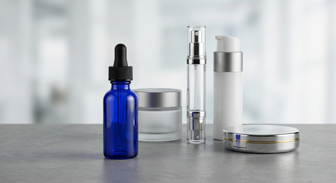
An amber glass dropper bottle is the conventional choice when a skincare brand wants a brown-tinted container associated with apothecary or ingredient-focused packaging. Amber glass generally exposes less of the liquid to visible light than a clear bottle, but the amount of protection is not defined by the word amber alone. Glass composition, color intensity, wall thickness, bottle geometry, fill level and any label or outer pack can all affect the result.
The strongest reason to shortlist amber is that it combines a familiar protective-looking appearance with a relatively broad range of brand styles. It can suit facial oils, botanical serums, concentrated treatments and other products where the brand wants a more technical or traditional presentation. Those are visual and packaging-use directions, not claims about formula efficacy or guaranteed stability.
Advantages to consider
- Reduced visual exposure compared with clear: the tinted body can limit direct visibility of the liquid and may help manage the package’s light environment. Ask for project-specific information if light transmission is a critical requirement.
- Recognizable category cue: brown glass is commonly associated with apothecary, botanical and laboratory-inspired concepts.
- Compatibility with varied decoration: labels, screen printing and contrasting collars can be evaluated against the darker body.
- Better concealment than clear: formula color is less dominant on shelf, which can help maintain a consistent appearance across batches with slight natural color variation.
Trade-offs for procurement and quality teams
- The darker body can make it difficult to see the true fill line, sediment, separation, discoloration or remaining product.
- Amber shades can vary visually between references, production lots, glass thicknesses and lighting conditions. A physical master sample and an agreed visual tolerance are important.
- A surface coating or spray can look similar to colored glass but may have different durability and light-transmission behavior. Confirm the construction instead of relying on a product photograph.
- The closure may be made from different materials than the bottle. Check the bulb, pipette, wiper, collar and liner or sealing interface with the formula.
YBJ Packaging’s matched amber glass dropper bottles for skincare are a useful starting reference for reviewing the brown-glass direction. The product page and approval documents should be used to confirm the exact capacity, dimensions, neck finish, dropper assembly, decoration options and project availability. Do not infer those specifications from the image alone.
For a buyer choosing amber, the sample brief should state whether the goal is simply a brown apothecary appearance or a documented light-management requirement. If the latter applies, request the available technical information and test the filled package under the intended storage and display conditions.
Opal white glass: an opaque premium presentation
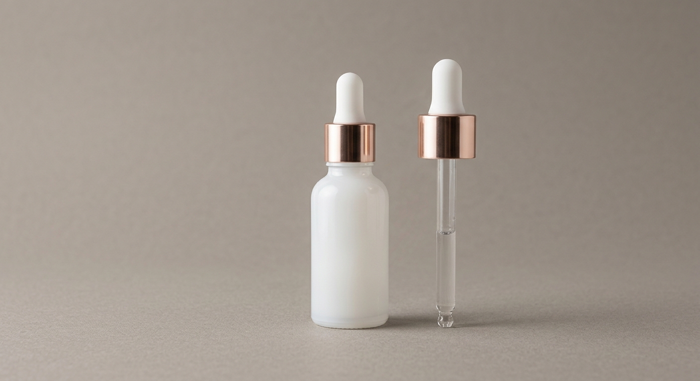
Opal white glass is selected when the exterior appearance should be white, soft and visually consistent rather than transparent. An opal glass serum bottle can make the formula largely invisible from the outside and gives the brand a neutral base for black, gray, pastel or metallic decoration. The word opal describes a visual direction, not a universal transmission specification, so the supplier should confirm whether the proposed body is true opal glass, a treated surface or another construction.
Opal can be a strong choice for brands that want a clean skincare presentation without showing the liquid’s natural color. It is also useful when the formula’s color is not intended to be a major merchandising feature. However, concealment can become a quality-control limitation: users may not be able to see the actual fill level or notice visible changes in the formula before dispensing.
Advantages to consider
- Consistent exterior color: a white body creates a controlled canvas for a minimalist identity and can reduce dependence on the formula’s own shade.
- Low visual transparency: the body often conceals the product more effectively than clear glass, although the exact result should be judged using a filled sample.
- Premium pairing options: the white body can be combined with a contrasting bulb, dark collar or metallic-look collar, subject to the supplier’s available components and decoration process.
- Strong shelf differentiation: opal white can stand apart from the common brown and transparent serum-bottle directions.
Trade-offs for procurement and quality teams
- Fill visibility is limited, so fill-weight or fill-volume controls and component checks become more important during production and quality review.
- White surfaces can reveal scuffs, contamination, uneven decoration or color variation more readily than a dark tinted body.
- Opal, frosted clear and white-coated glass can look similar in photographs but may have different surface, light and decoration characteristics.
- The closure and collar are highly visible against the white body. Confirm the exact finish, color, texture and scratch-resistance expectations using physical samples.
YBJ Packaging’s matched opal white glass dropper bottle with rose gold collar provides a concrete visual direction for premium serums, facial oils and concentrated treatments. Its product listing describes the rose-gold-collar configuration, but buyers should still confirm the exact bottle capacity, neck finish, dropper materials, color tolerance, decoration method and availability for their project.
Choose opal when concealment and a white visual identity are deliberate decisions. Before approval, ask whether the selected opal body provides the required light attenuation for the formula, or whether its role is primarily visual. Those are separate requirements and may lead to different sample and testing plans.
Clear glass: maximum product visibility and decoration flexibility
A clear glass dropper bottle makes the formula, fill level and liquid color part of the customer experience. This can be valuable for transparent oils, colored serums, products with a distinctive natural appearance or brands that want an ingredient-led and honest visual presentation. Clear glass also gives the design team more freedom to coordinate the label, liquid color, collar and bulb as one visible system.
The central trade-off is light exposure. Clear glass generally allows more light to reach the formula than tinted or opaque alternatives. If the formula is light sensitive, a clear bottle may require an opaque label, full-coverage decoration, carton, sleeve, light-controlled storage or another package-level measure. Whether those measures are sufficient must be determined with the filled product and the brand’s stability criteria.
Advantages to consider
- Immediate product inspection: users can see the liquid color and approximate remaining quantity, while quality teams can more easily inspect appearance during filling and review.
- Flexible visual storytelling: a clear body can showcase a naturally colored formula, suspended visual elements where appropriate, or a deliberately minimal package.
- Decoration visibility: labels, transparent labels, direct print and surface effects can be compared without the body color dominating every concept.
- Easy color coordination: the formula, label, collar and bulb can be designed as visible parts of the same palette.
Trade-offs for procurement and quality teams
- Light-sensitive formulas may need additional evaluation and protective package features.
- Glass clarity makes bubbles, scratches, fingerprints, label misalignment and fill variation more noticeable.
- Formula color can vary between raw-material lots or manufacturing batches, which may affect the final shelf appearance.
- Transparent decoration may not provide the same exposure reduction as an opaque label or full-coverage treatment. Coverage, seams and exposed shoulder or base areas should be reviewed.
Clear is not automatically the wrong answer for a sensitive formula, and amber or opal is not automatically the right answer. A clear package can be considered when the brand has a documented exposure-control approach and the formula passes the intended package assessment. Conversely, a tinted body may still need testing if the product has a strict light requirement.
When requesting a clear option, specify whether the target is fully transparent glass, lightly frosted glass or a clear body with an opaque exterior treatment. These choices affect product visibility, decoration, tactile feel, inspection and potentially light transmission. Ask the supplier to provide the same closure and label construction that will be used in the comparison, so the samples represent the final package rather than an incomplete bottle.
Match glass color to formula exposure and packaging requirements
Glass color should follow the formula’s exposure profile, not replace it. The formulation team should identify whether the product is affected by ultraviolet light, visible light, oxygen exposure, repeated opening, temperature changes or interaction with package components. Packaging procurement can then translate those needs into a bottle, dropper assembly and decoration brief.
Before choosing among skincare serum bottle colors, document the following information:
- Formula type and viscosity: State whether the product is a thin serum, a more viscous treatment, a facial oil or another liquid format. Viscosity affects draw-up, return flow, drop formation and the user’s perceived dosage.
- Light sensitivity: Identify whether the concern is UV exposure, visible light or a broader photostability question. If there is a target exposure limit or test method, provide it with the inquiry. A general request for UV light cosmetic packaging is not specific enough to select a measured solution.
- Storage and display: Describe warehouse conditions, expected retail lighting, window exposure, transportation route and consumer use location. A package used in a closed carton has a different exposure environment from one displayed on an open shelf.
- Opening frequency and air contact: A dropper format is opened repeatedly. Evaluate whether the formula’s oxygen or contamination sensitivity makes a different dispensing format more suitable. Glass color does not control the air introduced during use.
- Formula-package contact: Review the glass body together with the bulb, pipette, wiper, collar, liner, adhesive, ink and coating. Each component should be considered for compatibility, odor transfer, swelling, stress, adhesion and functional performance where relevant.
- Filling conditions: Provide fill temperature, target fill volume, headspace expectations, filling equipment and capping or assembly method. These details can affect component fit, leakage, dosage and final appearance.
For example, a clear bottle may be appropriate for a visually distinctive serum that is stored in an opaque carton, provided the formula and package assessment support that direction. An amber bottle may be a sensible first sample for a formula where light exposure is a concern, but the bottle still needs to be filled, closed, decorated and evaluated under the intended conditions. Opal may be preferred when the brand wants the strongest visual concealment, while the quality team accepts that the formula cannot be inspected through the body.
If the dispensing requirement is more important than the bottle color, compare a dropper with a pump or airless format before finalizing the design. The decision depends on viscosity, target dose, user behavior, fill volume, package dimensions and the formula’s exposure needs. YBJ Packaging can support format and material discussions, but the appropriate configuration must be confirmed through project review and samples.
Why color alone cannot establish shelf-life performance
A color name does not provide a complete light-transmission curve, and it does not prove that a formula will meet its intended shelf-life or appearance requirements. Two bottles described as amber can have different glass compositions, wall thicknesses, shapes and exposed areas. Two opal bodies can also differ in how much light reaches the formula. A photograph cannot resolve those technical differences.
For a meaningful comparison, consider at least these package variables:
- Wavelength: ultraviolet and visible light are not identical exposure conditions. A package may reduce one portion of the spectrum more effectively than another.
- Wall thickness and geometry: shoulders, base thickness, corners and the actual liquid path can change the amount of glass through which light travels.
- Color concentration and construction: determine whether the color is part of the glass or applied to the surface, and ask what information is available for the selected construction.
- Fill level and headspace: the exposed glass area and the amount of air above the product can change during use and over the product lifecycle.
- Decoration and secondary packaging: labels, coatings, cartons and sleeves may cover some areas but leave the neck, shoulder, base or seams exposed.
- Storage and display: temperature, retail lighting, shipping duration and warehouse conditions are part of the real use environment.
The phrase UV protection should therefore be handled carefully in a B2B specification. It may describe a product direction or a supplier’s product-page terminology, but it should not be treated as a universal performance guarantee without project-specific data. If the requirement is critical, ask for available transmission information or agree on a filled-pack test plan with the formulation and quality teams.
A practical assessment can compare the intended formula in shortlisted amber, opal and clear packs against a suitable control under the brand’s defined exposure conditions. The responsible technical team should decide which attributes to monitor, such as appearance, odor, color, pH, viscosity or an ingredient-related indicator where applicable. This article does not establish a test method or a regulatory acceptance standard; the test plan must reflect the formula and market requirements.
Also remember that shelf-life performance is not only a light question. A dropper bottle can introduce air and handling contact each time it is opened. Closure fit, pipette return, wiper function, leak resistance, capping torque, fill process and user instructions may be just as important as the color of the glass.
Compare decoration, collar finishes and brand positioning
After the technical color shortlist is clear, compare how the complete pack will look and perform. The bottle body, collar, pipette, bulb, label, print and secondary carton are viewed together by the customer. Decoration can also change the amount of exposed product, so it should be included in light-management discussions rather than added at the end.
| Design area | Amber | Opal white | Clear |
|---|---|---|---|
| Label contrast | Light, white or metallic artwork may stand out, but check legibility on the dark brown surface. | Dark artwork normally creates a clear contrast; confirm white-on-white details and color consistency. | Artwork competes with the formula and background, so label opacity and application position matter. |
| Direct print or coating | Review ink color, adhesion and abrasion appearance on the selected glass surface. | Review coverage, scuff visibility and whether the finish changes the intended white appearance. | Review transparency, edge definition and whether the decoration provides adequate visual or light coverage. |
| Collar and bulb | Black, white or metallic-look components can create different category cues. | The collar is prominent against the white body; a rose-gold-look finish creates a warmer premium direction. | All component colors remain visible, so the assembly should be judged from every angle. |
| Quality checkpoints | Shade, print registration, label alignment and scratches may be most visible under bright lighting. | Body whiteness, surface marks, finish consistency and decoration alignment require close review. | Clarity, bubbles, scratches, fingerprints, label seams and fill variation are easy to notice. |
Common decoration routes may include pressure-sensitive labels, direct screen printing, surface effects, opaque coverage or a coordinated carton. The right method depends on artwork, order quantity, surface geometry, durability expectations, color requirements, filling line handling and destination. YBJ Packaging’s guide to cosmetic packaging decoration techniques can help structure the initial discussion, but a decorated approval sample remains necessary.
Ask the supplier to show artwork on the actual body color instead of approving a flat digital rendering. Review the sample under retail lighting and ordinary indoor lighting. Check the shoulder, base, neck and label seam, not only the front panel. If a metallic collar or printed bulb is part of the identity, approve those components at the same time as the glass.
For a premium brand, a small difference in collar tone can change the overall impression more than a small difference in body color. For a clinical or ingredient-focused brand, accurate text contrast and lot-code placement may be more important than a decorative effect. These are positioning decisions, not universal rules. The brief should identify the intended visual priority and the tolerance for variation.
Check capacity, fill volume and user dispensing needs
Glass color is only one part of a dropper-bottle specification. Capacity, target fill, neck finish and dispensing behavior determine whether the package works on the filling line and in the customer’s hand. A supplier cannot confirm the correct configuration from the product category or a reference image alone.
Separate nominal capacity from target fill
Nominal capacity is the volume the bottle is designed to hold under a defined measurement convention. Target fill volume is the amount of formula the brand intends to put into each unit. They are related but not interchangeable. Headspace, fill tolerance, the shoulder profile, pipette length and the desired visual fill line should be discussed before the bottle is selected.
Do not select a bottle because a photograph appears to show a familiar size. Confirm the technical drawing, bottle height, diameter, shoulder shape, glass weight, label panel and actual fill behavior. A smaller bottle may support a concentrated product or trial format, while a larger bottle may provide a different user experience and shipping footprint. The appropriate size depends on the use instructions, dose, retail positioning, carton dimensions and expected quantity.
Define dosage as a component-and-formula result
Dosage is the amount dispensed during one defined user action. With a dropper, the amount per drop or pipette draw can change with viscosity, density, surface tension, tip shape, bulb volume, pipette dimensions, fill level, temperature, bottle angle and squeeze behavior. Therefore, a nominal drop count should not be promised without testing the intended formula and assembly.
For a serum where the user needs a repeatable amount, state whether the target is a number of drops, a full pipette, a marked pipette volume or another instruction. If the specification is strict, request a dispensing evaluation using the actual formula. Compare first-use and near-end-of-fill behavior, because the headspace and liquid level change during use. Also check whether the pipette reaches the product without scraping the base or creating an uncomfortable angle.
Confirm the neck finish and assembly
A neck finish is the standardized shape and thread detail at the bottle opening. It determines whether the selected dropper closure can engage, seal and sit at the correct height. The nominal bottle color does not guarantee compatibility with every dropper. Review the bottle drawing and closure drawing together, including thread dimensions, sealing surfaces, wiper position, collar fit and capping torque.
YBJ Packaging’s cosmetic bottle neck finish guide is a useful reference for preparing this part of the inquiry. For the project, request physical fit samples and test the assembly with the intended filling equipment. Confirm leakage, ease of opening, pipette return, bulb recovery, label clearance and the appearance of the fully assembled pack.
Your capacity and dispensing brief should include:
- Target fill volume and acceptable fill tolerance.
- Formula viscosity range, temperature during filling and expected use temperature.
- Desired user action, such as one drop, several drops or a full pipette.
- Bottle dimensions, label area, carton fit and shipping constraints.
- Dropper bulb, pipette, wiper, collar and sealing requirements.
- Filling machine, capping method and any automation or manual assembly steps.
- Destination market, estimated quantity and target date for sample review and production planning.
How to approve glass color and light-protection samples
Sample approval should answer two separate questions: does the pack meet the formula and manufacturing requirements, and does it look like the brand intends? A color chip, supplier photograph or empty bottle can start the conversation, but it cannot replace an assembled sample filled with the intended product.
- Write the decision brief. Record the formula type, viscosity, target fill, capacity range, light concern, storage and display conditions, user dose, decoration, destination and target date. State whether light protection is a technical requirement, a visual preference or both.
- Request a shortlist. Ask for amber, opal and clear references where all three can be evaluated with comparable capacity, closure style and decoration area. If a clear sample is not already listed, ask the supplier to confirm availability rather than assuming it is a standard option.
- Confirm construction. Ask whether the body is colored glass, opal glass, frosted glass or a surface coating. Request available information on glass composition, wall thickness, dimensions, weight and light transmission when those details are important to the project.
- Check the complete assembly. Fit the selected collar, pipette, bulb, wiper and sealing parts. Review thread engagement, opening force, closure height, leakage, return behavior and the relationship between the pipette and the bottle base.
- Fill with the intended formula. Use the planned fill volume and, where possible, the intended filling equipment and capping process. Test the formula in contact with all relevant parts, including decoration or adhesive that may touch the package.
- Evaluate dispensing. Define the user action and compare drops or pipette draws at the beginning, middle and end of the fill. Record observations for thin and viscous areas of the formula range if more than one SKU will use the pack.
- Review light exposure. If light sensitivity matters, use the brand’s approved stability or photostability plan for the filled package. Compare the shortlisted colors under the defined exposure conditions and document the attributes that the responsible technical team considers relevant. Do not approve a light-sensitive package from color appearance alone.
- Approve decoration and color. Examine samples under consistent lighting and from multiple angles. Check body shade, opacity, transparency, print registration, label position, collar finish, bulb color, code area and carton interaction. Agree on visual tolerances and reference samples before production planning.
- Review handling and logistics. Confirm protective packaging for glass, case configuration, pallet or carton constraints, destination requirements and any handling instructions. Transit risk depends on bottle geometry, glass weight, component assembly and the shipping route.
- Document the final specification. Record the approved sample, drawings, materials, closure, decoration files, color standards, fill target, inspection points and approval date. Any later change to glass source, component, coating, label, formula or filling process should trigger a review.
A useful sample comparison set includes one empty bottle for appearance review, one assembled empty pack for fit, and filled samples for compatibility, dispensing and exposure assessment. The exact quantity and test duration are project dependent. YBJ Packaging can discuss sample development and one-stop packaging support, but compatibility, test acceptance, production timing and shipping remain subject to technical review and approval.
What to record on the approval sheet
- Reference image or physical color standard, with the lighting condition used for visual review.
- Body construction, color direction, finish and any exposed areas not covered by decoration.
- Closure and component specification, including the neck finish and sealing interface.
- Target fill and dispensing instruction, with observations from the intended formula.
- Decoration artwork, print or label position, finish, color references and code placement.
- Formula version, filling process, test conditions and responsible approvers.
- Known limitations, unresolved questions and the changes that require reapproval.
YBJ Packaging glass dropper bottle options to review
YBJ Packaging is a China-based OEM and ODM cosmetic packaging manufacturer serving skincare, makeup and personal-care brands. The company describes more than 20 years of cosmetic-packaging experience and one-stop support from consultation and design through mold development, material selection, manufacturing, assembly, quality checks and worldwide shipping.
YBJ Packaging also describes a 10,000 m² intelligent facility, a Class 10,000 cleanroom, 12 automated assembly lines and 23 Toshiba all-electric injection machines. In plain language, a cleanroom is a controlled environment designed to limit airborne particles; a Class 10,000 designation does not by itself mean that a product is sterile or that every regulatory requirement is satisfied. For a glass dropper project, ask which bottle, closure-component, decoration and assembly steps use which facility or process, and confirm the quality requirements that apply to your product.
The following matched references can help buyers create a shortlist. They are starting points for visual and format discussion, not complete technical specifications. Confirm capacity, dimensions, neck finish, glass construction, component materials, decoration, compatibility, MOQ, tooling, pricing, production time and shipping after project review and approval.
| Reference | Potential role in evaluation | Confirm before approval |
|---|---|---|
| Amber Glass Dropper Bottles for Skincare | Use as the amber visual and format reference when comparing a traditional brown glass direction with opal or clear. | Capacity, body dimensions, color consistency, glass construction, neck finish, dropper assembly, decoration and light-transmission information if required. |
| Opal White Glass Dropper Bottle with Rose Gold Collar | Use as an opal white presentation reference. The product listing presents the configuration for premium serums, facial oils and concentrated treatments. | Exact body and collar materials, white color tolerance, capacity, closure fit, decoration method, surface durability, formula compatibility and project availability. |
| Apothecary Cobalt Blue Glass Dropper Bottle with UV Protection | Use as an additional tinted-glass benchmark when the team wants to compare a stronger color direction beyond amber, opal and clear. | The product listing names UV protection and describes true cobalt glass rather than a painted surface. Ask for the specific transmission information, construction, component details and filled-package evidence relevant to your formula. |
| Clear glass direction to be confirmed by inquiry | Use when formula visibility, liquid color and transparent presentation are central to the design brief. | Availability, clarity, surface finish, capacity, closure, decoration coverage, secondary packaging and the light-exposure assessment for the intended formula. |
YBJ Packaging’s OEM and ODM model may be useful when the project needs more than a stock bottle. Buyers can discuss design adaptation, mold development, material selection, component matching, assembly, quality checks and shipping as one packaging-development conversation. The exact scope is project dependent. A glass bottle may also involve external glass production or specific component supply arrangements, so ask for the applicable process route and inspection plan.
When contacting YBJ Packaging, send the same technical brief to each shortlisted color. Comparing unequal bottles, closures or fill levels can make one color appear better for reasons unrelated to the glass itself. A controlled sample set gives the procurement, formulation, quality and design teams a more useful basis for approval.
Frequently asked questions
These questions often arise during a glass color packaging selection review. The answers are decision guidelines, not formula-specific performance guarantees.
Is amber glass always the best choice for a light-sensitive serum?
No. Amber is a reasonable first direction when reducing visible light exposure is important, but the selected bottle must be assessed for its actual construction, transmission behavior, decoration and use conditions. Formula stability work should determine whether the pack is suitable.
Is opal glass more protective than amber glass?
There is no universal answer based only on the color name. Opal often appears highly opaque and can conceal the formula, while amber is a tinted glass direction. The relative performance depends on the specific glass, wall thickness, exposed area and wavelength. Request technical information or compare filled samples if light management is critical.
Can a clear glass dropper bottle be used for skincare?
Yes, if the formula and package system support the exposure conditions. Clear glass is useful when product color and fill visibility are important. A label, carton or coating may provide additional coverage, but the complete filled package should be reviewed under intended storage and display conditions.
Does a darker bottle automatically provide UV protection?
No. A dark appearance does not establish a measured UV transmission result. Confirm whether the body is colored glass or a surface treatment and ask what project-specific information is available. The product listing for a matched cobalt-blue reference names UV protection, but buyers should verify the exact specification and evidence for their formula.
Will one dropper deliver the same dose for every serum?
No. Dose depends on viscosity, density, surface tension, pipette and tip dimensions, bulb behavior, fill level, temperature, bottle angle and user action. Test the intended formula with the complete assembly and define whether the instruction is based on drops, a pipette draw or another measure.
What should be included in a sample request?
Provide product type, formula or viscosity context, target capacity and fill volume, bottle dimensions if known, glass color and material direction, closure or pump, decoration, estimated quantity, filling application, destination and target date. Also state any light-exposure, compatibility, dosage, color-tolerance or shipping requirements.
Request amber, opal or clear glass dropper bottle samples
The most efficient inquiry compares the complete package rather than asking only for a color catalog. Tell YBJ Packaging whether your priority is light management, formula visibility, premium presentation, dosage control, decoration or a specific combination of these requirements. Invite a sample or compatibility discussion, while allowing the supplier to review the project before confirming feasibility, MOQ, pricing, timing or shipping.
Include this information in your request:
- Product type and formula or viscosity context.
- Target capacity, fill volume and preferred bottle dimensions.
- Amber, opal, clear or another glass-color direction.
- Glass construction preference, if known, and any light-transmission requirement.
- Dropper, pump or closure preference, including dosage expectations.
- Decoration, label, print, collar and bulb finish requirements.
- Estimated quantity or annual demand, without assuming a standard MOQ.
- Filling application, equipment, fill temperature and assembly method.
- Destination country or region, packaging and shipping considerations.
- Target date for samples, approval or commercial launch.
Send the formula information that can safely be shared, together with drawings, artwork or reference images when available. Ask which details require a technical review and which changes would require a new sample. A documented comparison of amber, opal and clear glass can help your formulation, procurement, quality and design teams make one decision based on the same evidence.
Request a glass dropper bottle comparison
Send YBJ Packaging your product type, formula or viscosity context, target capacity and fill volume, dimensions, glass material or color direction, closure or pump, decoration, estimated quantity, filling application, destination and target date. Ask about amber, opal and clear samples, compatibility review and the information needed to approve the complete package. MOQ, tooling, pricing, production timing and shipping depend on project details and approval.

 English
  Français
  Español